
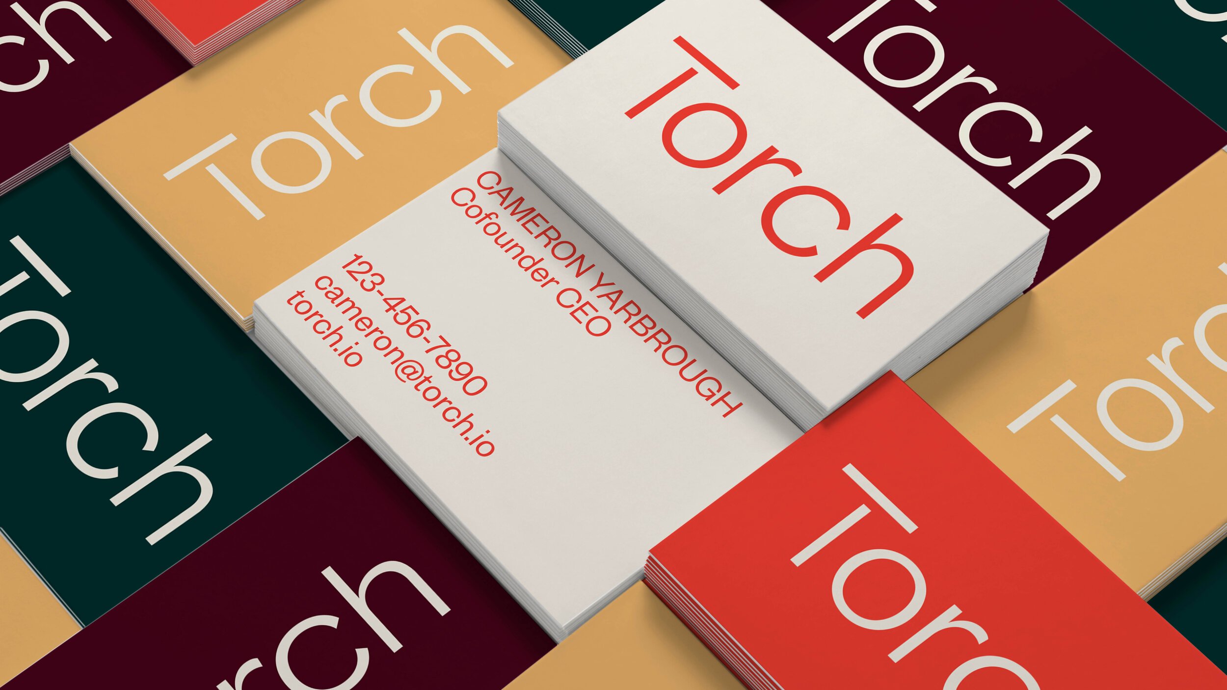
Torch is an integrated platform for learning and developing leaders that seeks to deliver, manage, and measure employee growth at scale. Along with the West design and strategy team, I contributed to the Torch rebranding by helping redefine the brand guidelines, the color palette, the “Dynamic T” icons and mockups among other design components. All of this allowed us to portray Torch as an opportunity to build people up, to accelerate growth and to build empathy in service of organizational success and business wins.


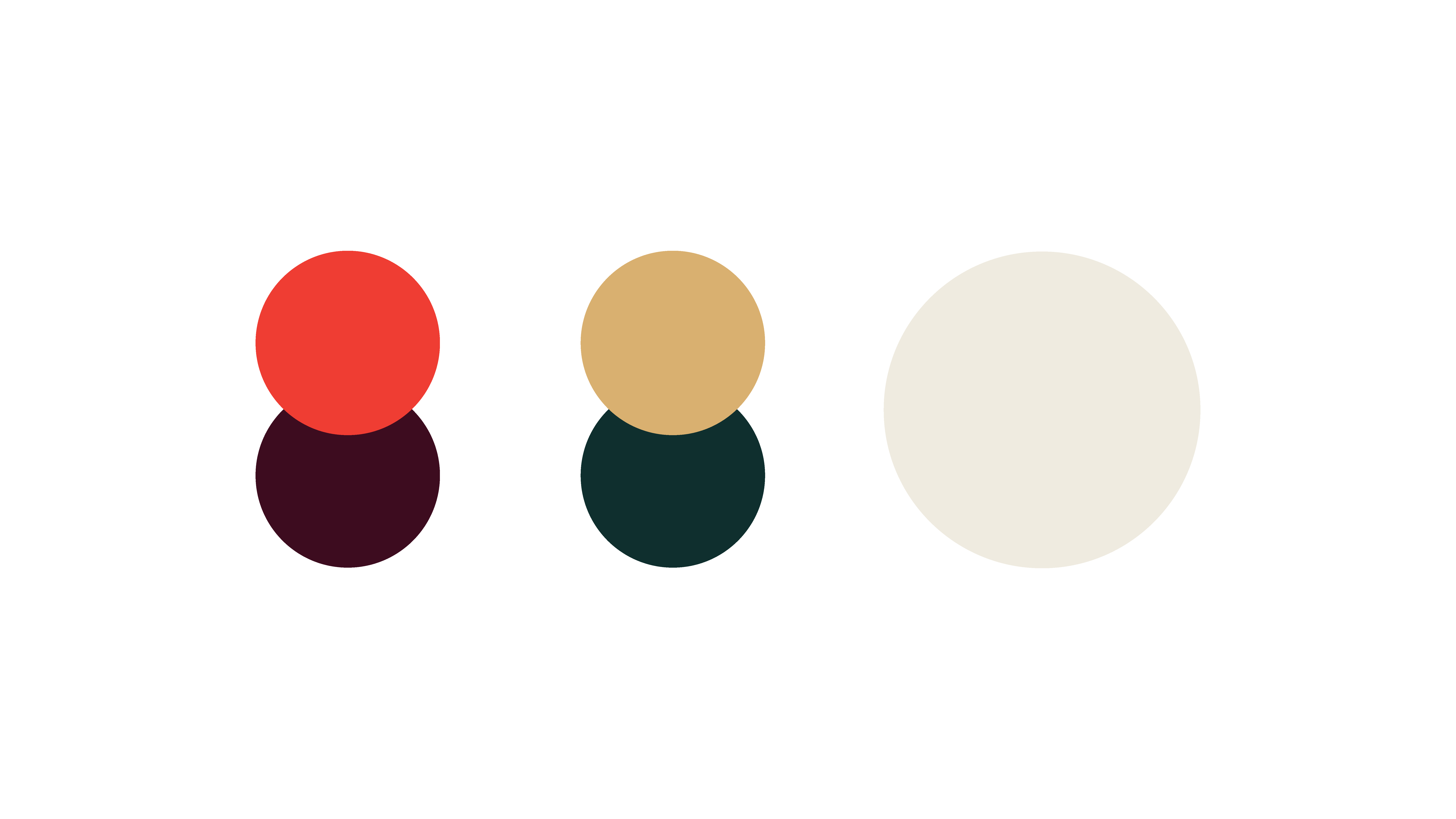
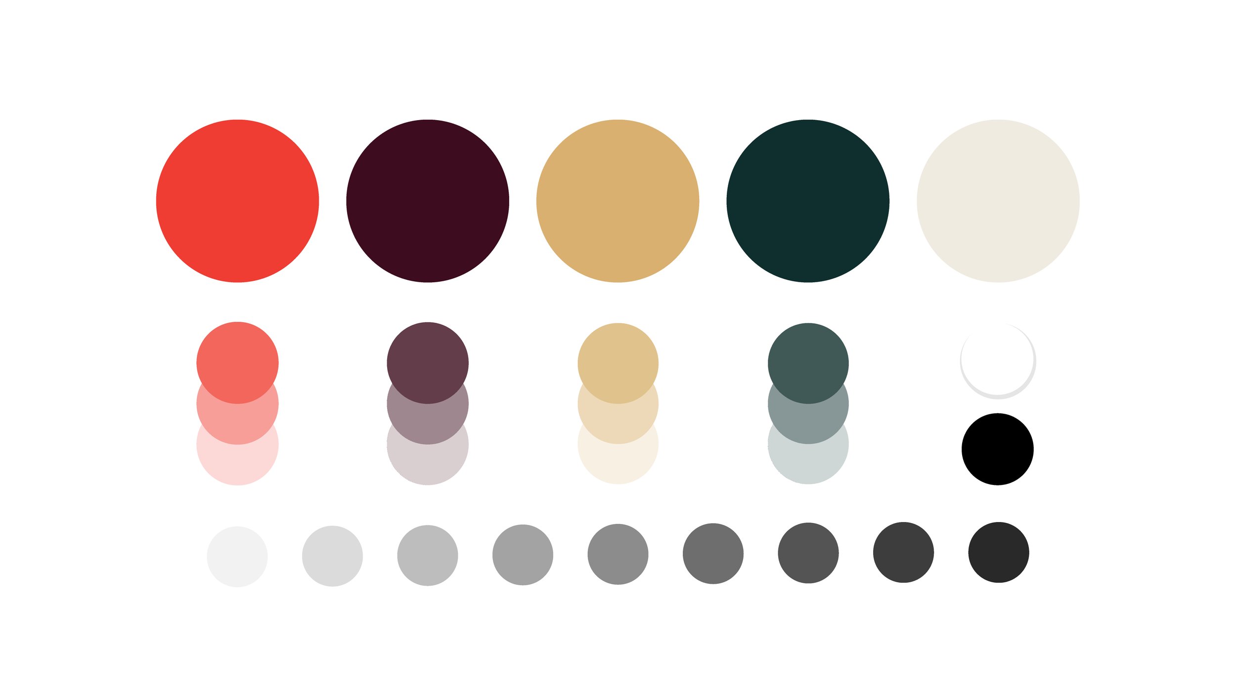
Torch’s color palette is mature and warm, but also brings an edge through unexpected combinations.


This is Torch’s device - it is referred to as the "Dynamic T". It functions as an activator within the visual identity system, adding movement and energy. Its origin is best describe as a visual representation of two individuals interacting with each other. It is a dynamic expression that can flex to represent human connection.


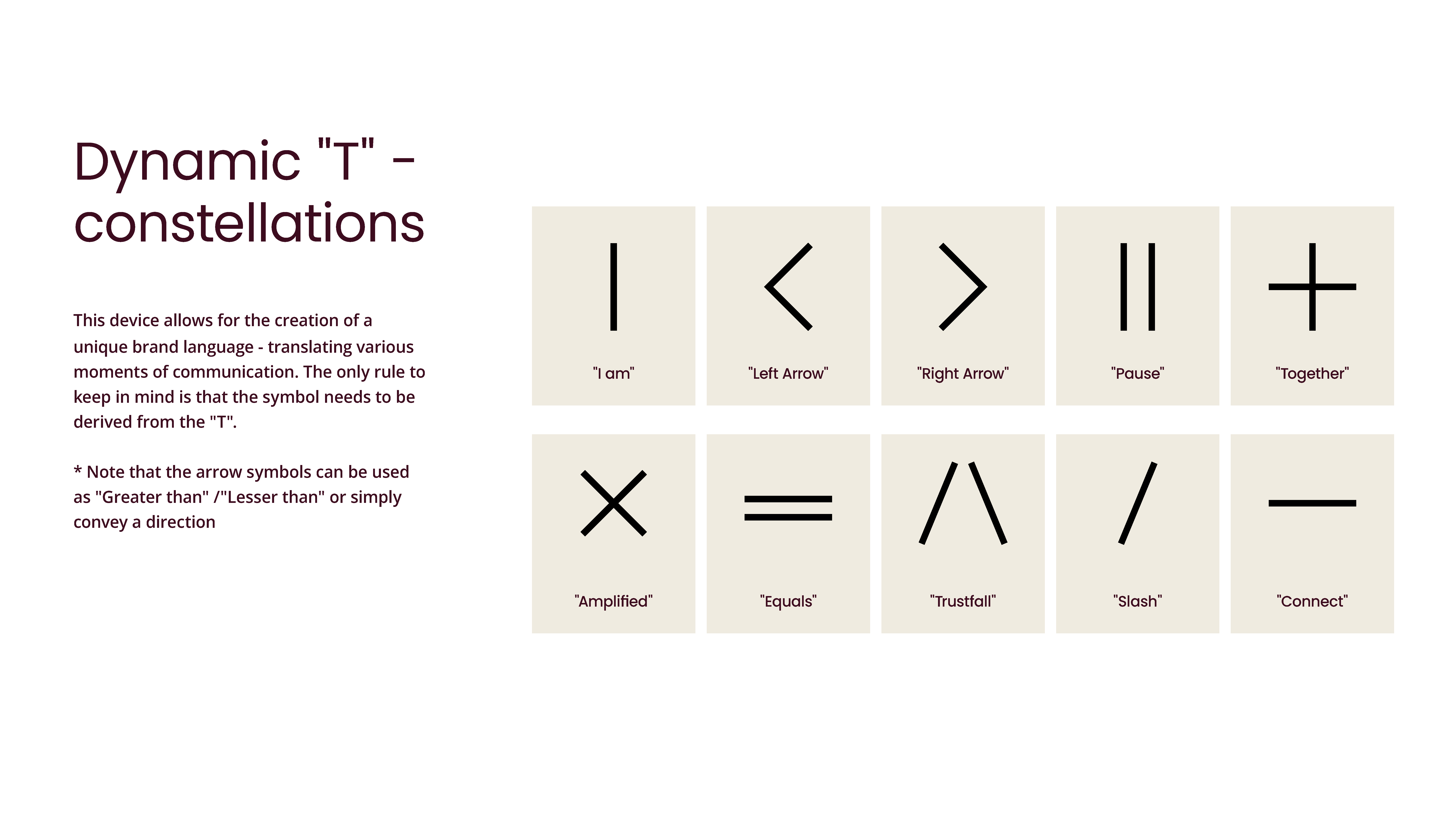
During the Torch rebranding, I was responsible for creating icons that would resemble Torch Language; they had to be clean, clear and minimalist with no significant hard edges. These aimed to improve visual interest while providing functionality by aiding navigation.


